The Apt Comparison: Are You Using the Right Benchmark Data?
Spring means different things to different people. For me and my team, it’s when we present employers with the final report and data tables from the current National Survey of Employer-sponsored Health Plans and start laying the groundwork for the next one.
The new report, reflecting responses from more than 1,800 organizations, focuses on important national trends in employer-sponsored health programs – the shift toward cost-management strategies that rely less on consumerism and more on higher-value care; the prioritizing of behavioral health; the growing role of virtual care; and new efforts to make benefits more inclusive and more equitable. We also touched on these trends here.
But then there are the more than 70 tables with results broken out by employer size, industry, and region, where benefits professionals can find data that’s not just interesting but actionable. Benchmark data can tell you how your program stacks up against those in similar organizations – the ones you compete with for talent. There’s enormous variation among employer plans that’s hidden in national results, and benchmark data brings it to the surface.
Let’s start with industry. Nationally, enrollment in consumer-directed health plans (CDHPs) has been growing for more than a decade, but it’s grown faster in some industries than others. Looking at results for large employers (those with at least 500 employees), enrollment in HSA-eligible CDHPs is highest in financial services, at 50% of all covered employees, but when you look at the healthcare industry, the enrollment rate is barely half that, at 27%. The financial services industry has a higher average salary than other industries, so employees have more to gain from the tax-advantaged status of their health savings accounts. If a financial services employer wants to know whether their HSA plan enrollment is leading or lagging, the best comparison is to 50%, not the national average of 34% for all large employers.
Plan design varies by industry as well. Again looking at results for large organizations, transportation, communications and utility employers are the most likely to reduce premium contributions for not using tobacco (42% compared to the national average of 25%). Financial services employers are the most likely to cover in vitro fertilization (36% compared to the national average of 27%).
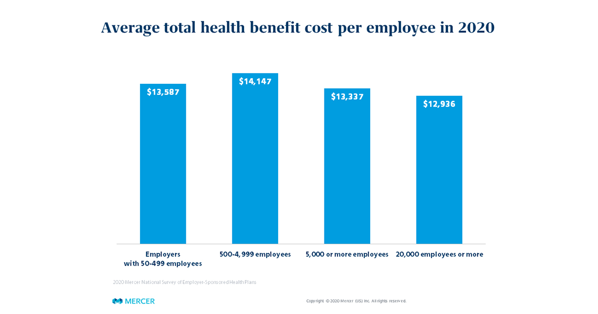
Employer size also has a big impact on survey results. The smallest employers, with 50-499 employees, have lower average cost than those with 500 or more employees, due to generally less rich plan design and higher family contributions. In 2020, total health benefit cost per employee averaged $13,587 among small employers. But cost doesn’t keep increasing along with employer size. It’s actually highest among the mid-sized employers (500-4,999 employees), at $14,147, and lowest among the largest employers (5,000 or more employees), at $13,337. In fact, among those with 20,000 or more employees, average cost falls to just $12,936.

Mid-sized employers compete with the largest employers for talent and need to offer comparable benefits, yet may not have the market leverage or the resources that the largest employers use to keep their costs down. That’s important for employers of both size groups to keep in mind when assessing plan performance again national averages. It’s also useful to see what strategies the largest employers are using to manage cost more successfully. For example, 53% of employers with 20,000 or more employees ensure employees use a specialty pharmacy by excluding specialty drugs from their Rx/medical benefit, compared to just 35% of employers with 500-999 employees.
Taking a look at regional data, we find some interesting differences as well. Employers in the West offer rich dental benefits – for example, 65% cover adult orthodontia, compared to 34% of employers in the Midwest – and per employee dental cost is well above the national average: $973 vs $806. Voluntary benefits to supplement medical plans are more common in the South – which means that employees in this region are more likely to expect their employers to offer them. Employers in the West have been the fastest to add pet insurance.
| % of employers offering voluntary benefit: | South | West | Midwest | Northeast |
| Accident | 73% | 62% | 70% | 58% |
| Cancer / critical illness | 67% | 54% | 62% | 54% |
| Hospital indemnity | 49% | 32% | 33% | 33% |
| Pet insurance | 30% | 44% | 20% | 39% |
**Based on employers with 500+ employees
Of course, the point of knowing how you stack up is to help you meet business and human resource objectives. Is your goal to make sure your benefits are in line with the typical programs in your market to ensure you have a competitive, but not overly rich, offering? Does your organization want to be seen as an innovator or on the leading edge in certain areas, and outpace the benchmark? If you’re in growth mode, maybe you should benchmark your programs against companies one size group up. The best use of benchmark data is to measure the distance between your organization and the cohort of companies you want to be in, and to build a strategy to close the gap.
Mercer’s 2020 National Survey of Employer-Sponsored Health Plans final report and data tables are now available for non-participants to purchase (participant receive the results free of charge). Visit our website to learn more.
